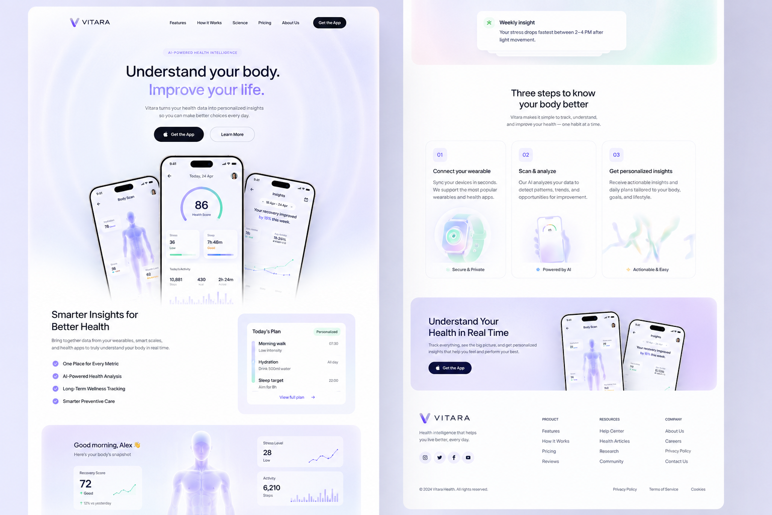
Project Overview
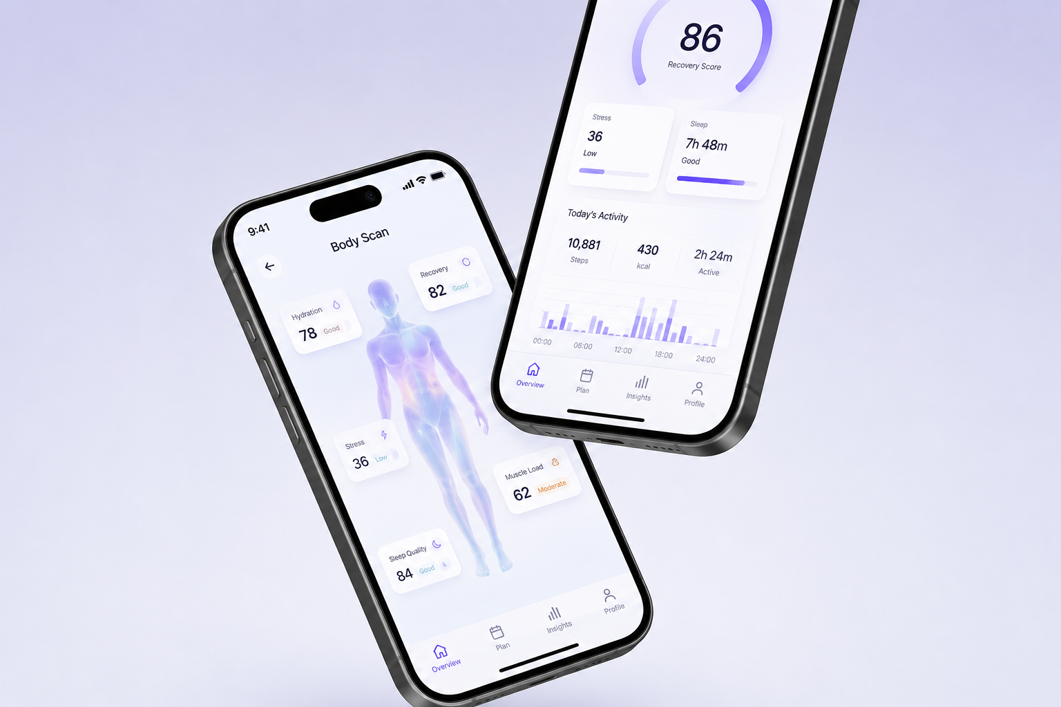
My Role
Problems
Goals
VITARA
AI-Powered Health Intelligence Platform
VITARA is a health intelligence platform designed to bring data from wearables and health apps into one clear, personalised experience.
The platform transforms complex health data into meaningful insights, helping users understand their body, track long-term patterns and make more informed everyday decisions.
Research UX/UI Design Product Design Branding Strategic Design
Fragmented Health Data
Users often have health information spread across multiple devices and applications, making it difficult to see the bigger picture.
Complex Information
Large amounts of health data can be difficult to understand without clear context or meaningful interpretation.
Limited Personalisation
Generic health metrics don't always help users understand what their data means specifically for them.
Simplify Health Data
Turn complex metrics into clear, digestible information that users can understand quickly.
Create Personalised Insights
Use AI to identify patterns and provide insights that feel relevant to each user's health and lifestyle.
Encourage Better Decisions
Transform passive tracking into actionable guidance that helps users make informed choices.
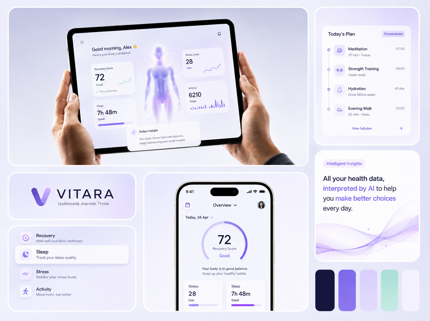
Design Approach
Colours
Branding
Visual Direction
A soft, calming palette of lavender, white, mint and deep navy was chosen to create a sense of trust while giving the product a modern, technology-driven identity.
Lavender and purple communicate intelligence and innovation, while mint introduces a sense of wellbeing and positive progress.
Highlight
Purple is used to emphasise primary actions, health scores and AI-powered features, creating a consistent visual connection between intelligence and interaction.
Design Rationale
The colour system balances healthcare credibility with the visual language of modern technology, creating an experience that feels sophisticated without becoming clinical or intimidating.
A Brand Built Around Understanding
VITARA's visual identity was designed around the idea of turning data into understanding.
The identity combines a minimal wordmark with a fluid abstract symbol representing movement, balance and continuous improvement.
Brand Personality
Intelligent
Calm
Human
Progressive
The branding avoids the traditional clinical aesthetic of healthcare products, positioning VITARA closer to the emerging intersection of health, AI and personal technology.
Outcomes
Personal Discovery
AI-Powered Insights
Simplified Health Tracking
A unified dashboard brings multiple health signals into one coherent experience, reducing the need to switch between different platforms.
Clearer Decision-Making
Personalised insights provide context around metrics, helping users understand what their data means rather than simply viewing numbers.
Stronger Product Identity
A distinctive visual language combines wellness, AI and technology to create a brand that feels modern and approachable.
Scalable Design Foundation
A consistent design system across dashboards, insights, plans and marketing surfaces creates a foundation that can scale as VITARA's product ecosystem grows.
AI-Powered Insights
Making Data Meaningful
AI was integrated as an interpretation layer rather than simply another feature.
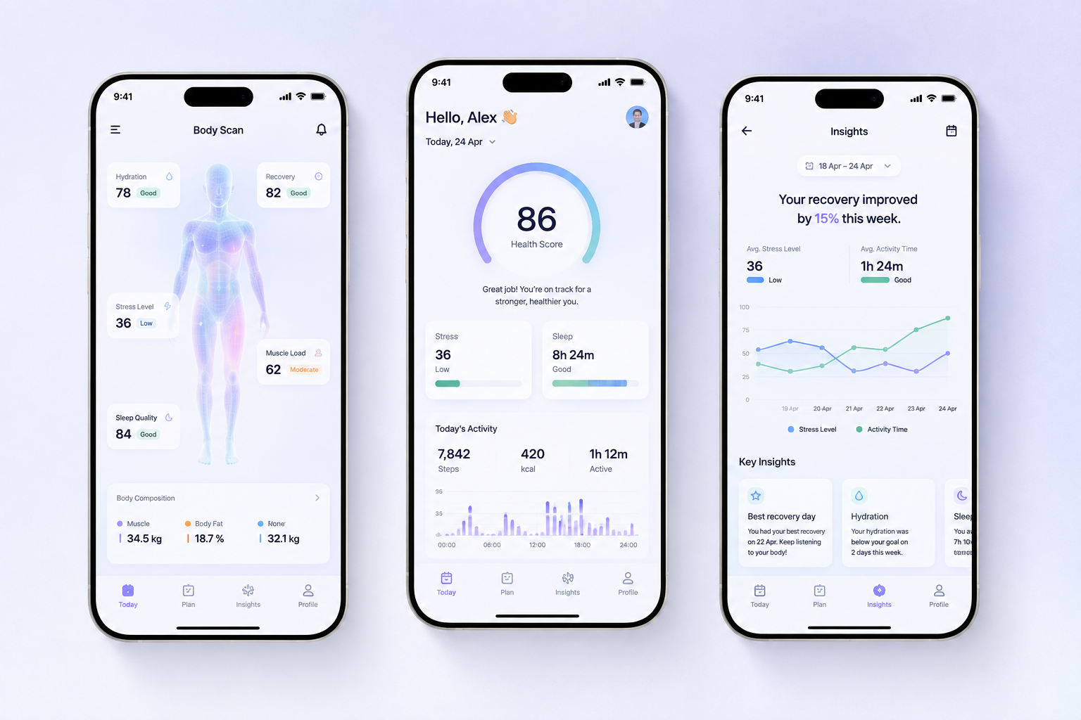
Instead of asking users to analyse multiple metrics themselves, VITARA surfaces patterns and translates them into understandable insights.
For example:
Your recovery has improved by 15% this week.
Your strongest recovery days followed nights with longer sleep.
This approach helps users understand why something is happening, not just what happened.